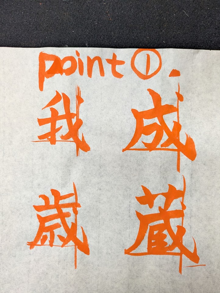
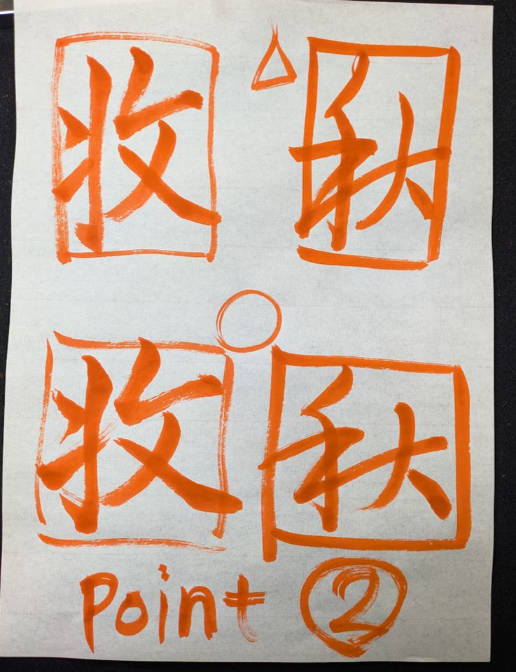
I corrected Martin’s work while studying in Denmark.
Each time, I focus on three important points to keep in mind.
This time I drew out the key points of the glyphs.
Warp balance
If the letter is elongated due to the border of the felt underlay, it will look better if you spread it out horizontally.
These are points that everyone should be aware of.
This is one of the points I would like to convey to students who have just started learning calligraphy.
Also, I felt that I needed to be a little more careful about the frame line that caused the font to become thinner.
A common calligraphy pad with a border is very convenient because you can see the guideline without having to make fold lines on the paper.
However, if you rely too much on this convenient frame line, you will not be able to flexibly correct it if it goes slightly off.
You need to be careful, as you may end up writing the letter with it being misaligned, or end up with a letterform that is not suitable for the original shape.
If you understand good basic letterforms, you can make up for any slight deviations.
There are many important things that can be helped by tools, but
I think the most important thing is how much you can wear in your own hands.
First of all, let’s practice hard so that the most reliable thing is the “tool < yourself” ^^/


